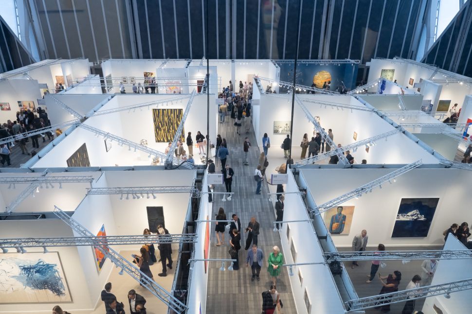
Every year, New Yorkers eager to see what’s new at the city’s edition of Frieze trek out to The Shed at Hudson Yards, a building used for this art fair, a silly play about Robert Moses and presumably other purposes. Standing in the VIP lounge on the top floor, I gazed out on Thomas Heatherwick’s Vessel, newly reopened with suicide nets, and wondered aloud to my colleagues whether said nets would save more lives than an encouraging slogan from Lady Gaga. Art can be quite powerful, you know.
I should clarify that none of us wanted to kill ourselves. As for the dealers, it’s always hard to get solid information out of them. (“Frieze New York leads high-stakes month for U.S. art market,” read the front page of the edition of the Art Newspaper distributed at the fair.) I truly wish them all possible success—much of their material was good, but these are the five works I liked best at the fair.
Jeff Koons’ Hulk (Tubas) (2004-18) at Gagosian
Jeff Koons depicting the Hulk with five polished brass tubas mounted on his back is displayed on a low platform at The Shed during Frieze New York.” width=”970″ height=”1293″ data-caption=’Jeff Koons, <em>Hulk (Tubas)</em> (2004-18). <span class=”lazyload media-credit”>Dan Duray for Observer</span>’>
It feels as though we haven’t seen these Hulks in some time, perhaps because of the way Marvel abducted and murdered the film industry—bad associations. But these are major works by the artist, and the associations are part of the reason why. Though it looks like a blow-up doll, it’s actually made of polychromed bronze and brass, the same objects that created the instruments that adorn its neck. Since his early vacuum cleaners, Koons has been into the symbolism of airflow. Bruce Banner’s dual nature references this falsely inflated nature better than the artist’s balloon dogs. It is wonderful that this work has a face with features that are only drawn. Someone snapped up this work right away, even though the price tag was likely in the millions.
Eunnam Hong’s Patient (2025) at Mendes Wood DM
Eunnam Hong shows a sterile, light-filled bedroom with a woman in curlers working on a laptop while holding a coffee cup, as another figure lies in bed.” width=”970″ height=”728″ data-caption=’Eunnam Hong’s <em>Patient</em> (2025). <span class=”lazyload media-credit”>Dan Duray for Observer</span>’>
This intimate moment will resonate with anyone who’s had to care for an ailing loved one or a clone. Though the arrangement of the tableau is cinematic, it is so flooded with light that we feel we’re not watching a movie but the filming of a scene. The white is dominant to the point where this work would be hard to look at if there were not so many other hooks to bring you in. Why are the characters wearing wigs, and why are these the most detailed parts of the painting? The subject matter feels classical, though the coffee cup and MacBook are so modern that we’re forced to confront the fact that maybe the real world has, in fact, become this dramatic.
P. Staff’s On My Death Bed / An Opus On Love / On Venus (telephone) (2025) at Sultana
P. Staff sits in a corner, featuring a handwritten U.S. phone number that visitors can call to hear poems.” width=”970″ height=”1293″ data-caption=’P. Staff’s <em>On My Death Bed / An Opus On Love / On Venus (telephone)</em> (2025). <span class=”lazyload media-credit”>Dan Duray for Observer</span>’>
“Microdosing grief on my deathbed,” begins the first poem in this trilogy, if you call the number listed here. I wondered what that lovely orange plasticky material was, but it’s not on the label, so it’s probably not important. In the spirit of John Giorno, the poems and the phone numbers are the work, and they’re all very strong, as is the performance. “I want to go through your likes / I want to eat your hands,” says the artist, breathless. All three of the poems are related. “New organs for everyone,” he promises of life on Venus. An Opus On Love becomes quite emotional at times. “I cannot replace you, creme de la creme.” Maybe it really isn’t important, but let me also say that I like the use of the Sharpie.
Jeremy Deller’s Stickered Door Retrospective (2021) at The Modern Institute
Jeremy Dellerâs installation, with political and humorous phrases like âFuck Brexitâ and âIâd rather be reading.â” width=”970″ height=”1293″ data-caption=’Jeremy Deller’s <em>Stickered Door Retrospective</em> (2021). <span class=”lazyload media-credit”>Dan Duray for Observer</span>’>
The buyer of this work receives a complete set of these stickers to recreate this effect on the door of their choice. Of course, this resembles a door on a college dorm room, but it also reminds you why it’s a good idea that those stickers are usually cleaned away, because the political opinions expressed here are hilariously quaint. Pray for the fictional people who slapped “Fuck you 2016” and “Fuck Brexit” on here because they have only had a rougher time since then. Another wonderful aspect of these stickers is their self-satisfied impotence. “Come friendly bombs and fall on Eton,” modifies a poem by John Betjeman so that it’s now a subtle dig at the upper classes. Yeah, that one’s sure to start the revolution.
Alvaro Barrington’s Carnival Truck (2024) at Anton Kern
Alvaro Barrington made with bright acrylic colors on burlap depicts a sun-like semicircle above blue, red and pink shapes in a textured composition.” width=”970″ height=”728″ data-caption=’Alvaro Barrington’s <em>Carnival Truck</em> (2024). <span class=”lazyload media-credit”>Dan Duray for Observer</span>’>
I’ve been following Barrington since he was invited to bring his studio to MoMA PS1 in 2017. The Venezuelan artist manages to conjure fantastic imagery with nothing more than geometry, bright colors and simple materials, in this case acrylic and flashe on burlap. Now based in London, he is commissioned to make works for carnival trucks there, which speaks to the upbeat and universal qualities of his work. They tend to feel three-dimensional, in this case because he lets so much of that burlap come through. This work is pleasant to be around. You look at the chunky way that blue was slathered on there and feel like you’re getting ready for the party yourself. Even if you didn’t know that this one was painted with an event in mind, its temporality is palpable.